From Laptimes to Dartboard
Same race. Same dataset. Two different interpretations.
First: raw lap times — complex, dense, almost unreadable.
Then: the same data, structured into signal.
No new inputs. No extra assumptions.
Just a different way of organizing reality.
That’s the PitWallGeek manifold — turning data into information and insight.
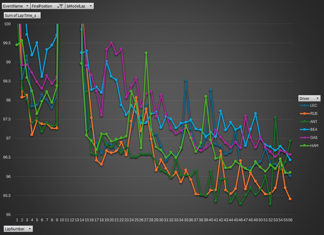
Lap time scatter plot
This chart shows lap time versus lap number for the lead group — the race as it actually unfolded. The opening laps are scattered, shaped by heavy fuel and traffic, with no clear signal. Around laps 12–16, the sharp drops mark the pit stop phase, resetting the field into new pace levels. In the mid-race, the lines stabilize and a pattern emerges: Antonelli and Russell settle into a lower, controlled band. However, every lap here is influenced by fuel, tires, and race events — so while structure is visible, the laps are not directly comparable.
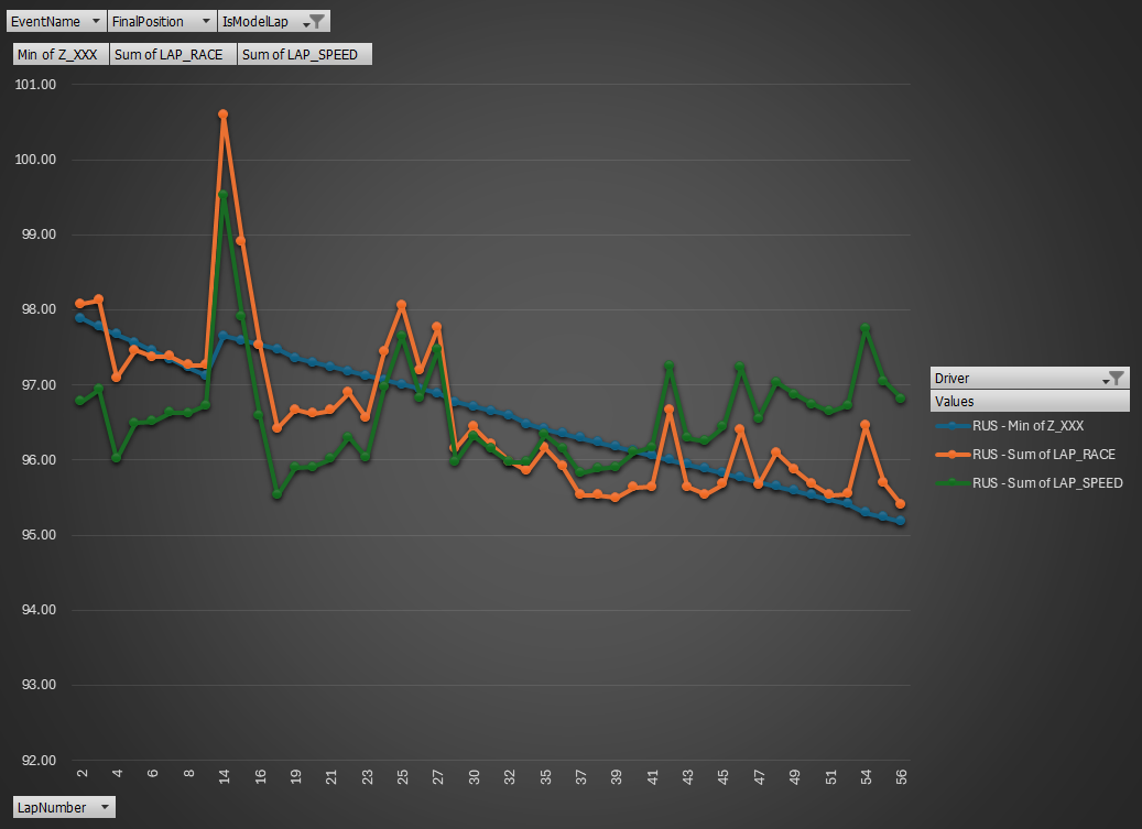
PitWallGeek Normalization
This chart shows Russell’s race transformed through the PitWallGeek manifold.
The orange line is the raw lap time from FastF1 — the same signal we saw before, affected by fuel load, tire compound, and race events. The blue line is the manifold baseline, correcting for fuel burn and aligning the expected performance decay across the stint — effectively modeling what the lap time should be as the car gets lighter. The green line is the normalized lap performance, where each lap is adjusted to comparable conditions, removing the bias between Medium and Hard compounds and isolating true pace.
In short, the race is still there in sequence, and total race time is preserved, but now each lap speaks the same language.
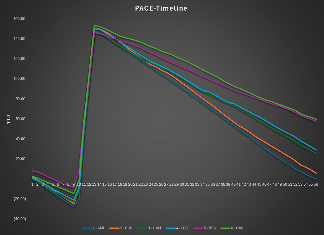
Gap to the leader
This chart shows the race in the PACE time domain — not as lap times, but as distance to the leader, using normalized laps.
Each line represents a driver’s gap to the average leader pace, reconstructed from laps where fuel load and tire degradation have been removed. What remains is pure driving performance, still evolving over the race timeline.
Because the noise of tire and fuel effects is removed, the slopes now carry meaning: a steeper downward line reflects stronger sustained pace. The race is still shown in sequence.
The Pace Timeline isolates driver performance by normalizing lap times for fuel burn and tire degradation. In other words, the PitWallGeek manifold removes the structural pace changes caused by race conditions so that all laps become directly comparable, while the pace timeline focuses on the driver’s underlying performance.
Once normalized, the leading group becomes even more compact. Mercedes and Ferrari display remarkably similar pace envelopes, confirming that the competitive level of the two teams was extremely close throughout the event.
Within this narrow window, the differences between teammates are small but consistent. Antonelli slightly edges Russell, while Hamilton holds a marginal advantage over Leclerc. The slopes of the curves remain nearly parallel across the stint, indicating stable pace and disciplined tire management by all four drivers.
The midfield cluster remains clearly separated. Bearman and Gasly benefited from race circumstances at times, particularly during pit cycles and traffic phases, but the normalized pace shows that their cars did not possess the underlying performance to challenge the leading quartet.
Overall, the Pace Timeline confirms that the race was fought between two evenly matched teams and four closely matched drivers, with track position ultimately deciding the outcome.
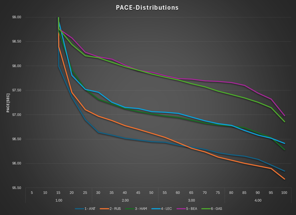
PACE distributions
Each driver’s normalized laps reordered from fastest to slowest. Time is no longer on the x-axis. Race events are gone. What remains is the performance envelope.
The race result is influenced by timing — track position, pit windows, execution.
The distribution removes that context and asks a different question:
How fast were you, lap after lap, under comparable conditions?
On that measure, Russell shows the stronger pure pace, even if Antonelli converted the race.
The Pace Distribution chart is where driver performance can be compared most directly. Because lap times are normalized for fuel load and tire degradation, the distribution reflects the pure pace envelope of each driver across the race.
The leading quartet again separates from the rest of the field, confirming that Mercedes and Ferrari defined the competitive ceiling of the event. Within that group, the differences become clearer when the distributions are examined quartile by quartile.
In the first half of the distribution, Russell loses ground to Antonelli. This reflects the race context: Russell spent several laps in traffic and became entangled in the Hamilton–Leclerc battle, while Antonelli ran largely in clean air from the front. Once Russell broke free and could exploit the Mercedes pace, his curve converges toward the leader, but by then the race had already been controlled by Antonelli.
The Hamilton–Leclerc profiles are remarkably similar, explaining the sustained and entertaining fight between the two. Across most percentiles Hamilton holds a marginal advantage, edging Leclerc throughout the distribution.
In Formula 1 the closest reference is always the driver in the same car — your teammate is not your mate. In this race the intra-team comparisons are clear: Antonelli leads Russell, while Hamilton edges Leclerc, revealing a weekend where the internal hierarchies within both teams briefly flipped.
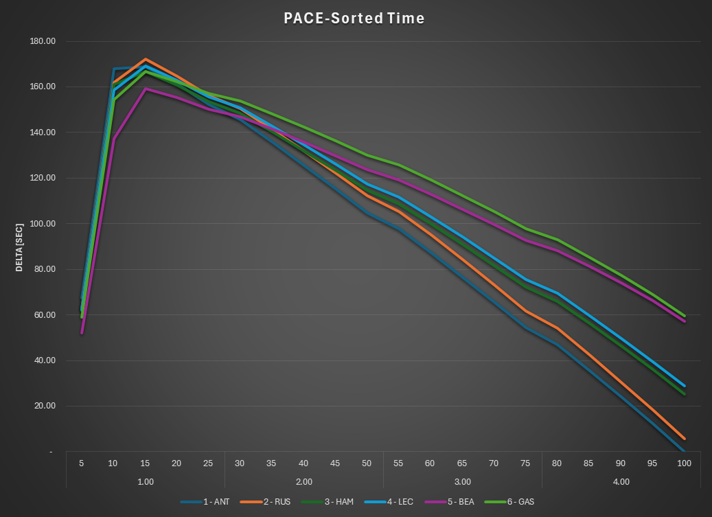
PACE Sorted Time
This chart reconstructs the race by integrating the PACE distributions — but now the timeline is sorted by performance.
The x-axis is no longer lap number, but percentiles: slow laps on the left, fastest laps on the right. The four quartiles make this explicit. What we are seeing is the same race, re-ordered from worst to best conditions.
On the left, the curves cluster and rise sharply — this is where entropy lives: opening laps, traffic, pit stops, and all the disturbances that inflate lap times. In the middle, the field begins to separate as conditions stabilize. On the right, the fastest laps dominate — clean air, low fuel, optimal grip — and the true pace hierarchy becomes clear.
The Pace Sorted chart reconstructs the performance gap to the race leader using normalized lap times.
The process starts with the PACE distributions, where all laps are normalized for fuel burn and tire degradation so that each lap reflects comparable driver performance. These normalized laps are then sorted by percentile and cumulatively integrated, rebuilding the time delta that would appear if every driver had run those laps under equivalent conditions. The result is a clean comparison against the average pace of the race winner, acting as a magnifying glass on performance differences.
Because the structural race effects have been removed, the curves reveal the true performance envelope of each driver. The two leading teams again appear tightly grouped, with Mercedes and Ferrari operating within a narrow pace window across the entire distribution.
The shape of the curves during the second stint on hard tires is particularly revealing. With tire wear stabilized and fuel loads lighter, the drivers settle into a long sequence of consistent laps where they extract the limit performance of their machinery. The nearly parallel slopes show disciplined pace management by the leading quartet.
Within that envelope the hierarchy remains subtle but visible: Antonelli maintains the reference pace, Russell follows closely once clear of traffic, while Hamilton and Leclerc remain locked in a remarkably similar performance band behind them.
Taken together, the Pace Sorted instrument confirms the broader picture emerging from the PitWallGeek manifold: a race decided by track position between four drivers operating at very similar underlying pace and yet superior racecraft made the difference
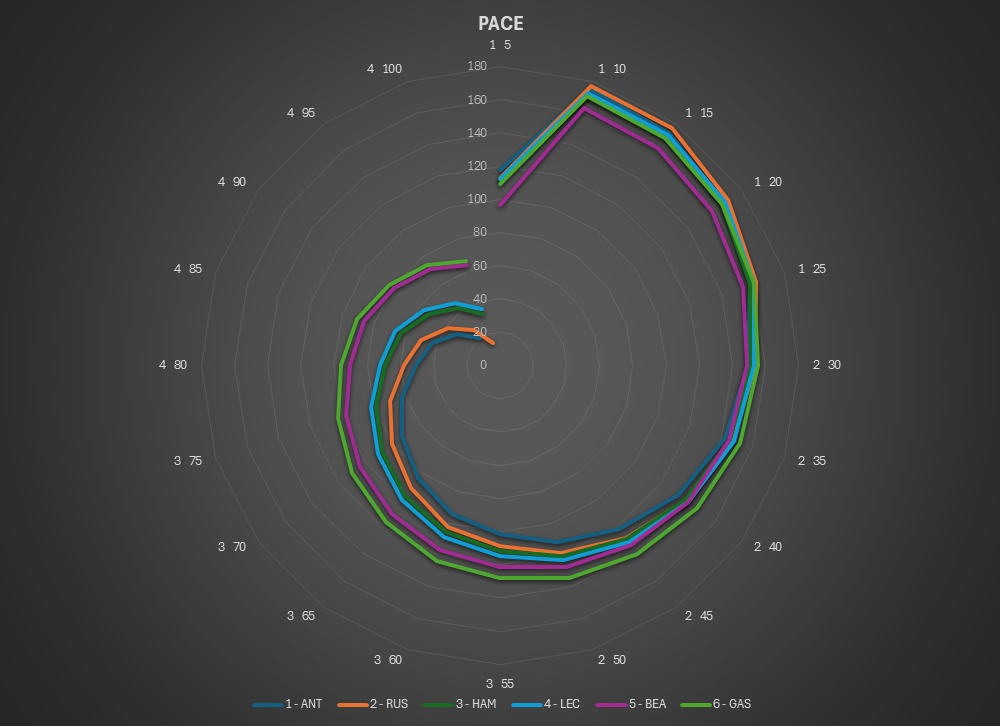
PitWallGeek Dartboard
This is the same PACE-sorted performance, now wrapped into a polar view — a compact, portable representation of the race.
Each driver’s path becomes a spiral toward the center. The outer rings capture the slowest laps — traffic, pit phases, race noise. As the spiral moves inward, conditions improve and true pace emerges. The closer and tighter the spiral, the stronger and more consistent the performance.
All the upstream complexity — normalization, distributions, sorting — collapses into this single image. What remains is intuitive:
closer to the bullseye is better.
It’s not just a chart.
It’s an instrument.
The Pace Dartboard presents the same information shown in the Pace Sorted chart, but in a compact visual format designed for rapid interpretation.
Each ring represents the sorted pace performance of the drivers, arranged from fastest laps near the center to slower laps toward the outer rings. By plotting the curves radially, the full pace distribution can be viewed simultaneously without scanning across a horizontal axis.
The competitive structure identified in the previous Pace instruments appears immediately. Mercedes and Ferrari form the leading cluster, with the midfield group clearly separated across the entire distribution.
A notable feature of the dartboard is the compression of the curves through the middle quartiles. In this region most drivers converge to very similar pace levels, reflecting the long second stint on hard tires where fuel loads, tire behavior, and race management produced very consistent lap times across the field.
The separation that ultimately defines the race emerges at the tail of the distribution, where the fastest laps accumulate. Here the drivers able to extract the final tenths from their machinery begin to separate from the pack. Antonelli maintains the reference pace, Russell converges once clear of traffic, and Hamilton edges Leclerc within the Ferrari–Mercedes battle.
Viewed as a whole, the dartboard acts as a visual summary of the Pace domain, compressing the full distribution into a single image where the competitive hierarchy of the race can be recognized almost instantly.